StandardButton
The StandardButton looks like a button, but instead of customizing with text and icon,
it can used one of the pre-defined kind and the text and icon will depend on the style.
Properties
Section titled “Properties”enabled
Section titled “enabled” bool default: false
Defaults to true. When false, the button can’t be pressed
has-focus
Section titled “has-focus” bool (out) default: false
Set to true when the button currently has the focus
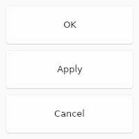
enum StandardButtonKind default: the first enum value
The kind of button, one of ok cancel, apply, close, reset, help, yes, no, abort, retry or ignore
StandardButton { kind: ok;}primary
Section titled “primary” bool default: false
If set to true the button is displayed with the primary accent color.
pressed
Section titled “pressed” bool (out) default: false
Set to true when the button is pressed.
Callbacks
Section titled “Callbacks”clicked()
Section titled “clicked()”Invoked when clicked: A finger or the left mouse button is pressed, then released on this element.
StandardButton { clicked() => { debug("Button clicked"); }}© 2026 SixtyFPS GmbH